About the Project
I was given the task of redesigning a webpage for a video live streaming platform. Vyulabs is a platform that enables TV and Media companies to schedule and produce high quality interactive video shows from many different browsers – mobile, web and in-app browsers of social media apps.
A quarantine savior, the website provided a great service. After receiving the initial task, I decided to observe and study the original website to fully understand how to best express this content for the appropriate audience.
-
Improve user engagement and page clicks
Harsh visuals and improper font sizing
Unclear what the website delivers to the user
-
Organize the flow of the website
Curate a more welcoming, engaging artistic palette
Demonstrate how the streaming services work
-
font is hard to read
too much text that is overwhelming the reader
messy spacing
there is no button to prompt the user to do an “action”

Finally, at the bottom of the page, we see this “comprehensive” graph break down the way Vyulabs works in terms of customer participation.
Personally, I did not find it comprehensive. We want to make the process make sense to every person. The outline takes the user away from its main purpose – to sign up and start streaming their content to their audience.
Design Phase
In order to properly the core demographic of Vyulabs, I had to improve upon the user journey and satisfaction. Joyful discovery is an essential part of the user journey, as the user interacts with this product and learns about its potential. By communicating visually without overpowering our users with a loud volume of information, our users can enjoy getting familiar with the brand and product.
Visual Identity
I wanted to appeal to an older consumer by incorporating minimal icons with neutral undertones. Using the right amount of color (60-30-10) in this redesign, I wanted to find a balance in engaging the user and giving them comprehensible information.
Vyulabs initially had a bright magenta color included on their site; however, I didn’t think it communicated the functionalities and possibilities of the brand. Instead, I shifted to a more modern and simplified aesthetic which includes a bright teal and soft sand. This excites the user, while keeping them at task.


I started with a basic template that I use with my mentor when creating homepages. However, our client wanted to use their editing software, so I did not get to use this information architecture the way I would’ve wanted to.
My goal was to make it clear for which user where to go. If you want to join a live podcast, the button to direct you there should be very apparent.

I still kept the color scheme the way the clients intended. The sophistication of the blue also invites users to engage with their content.

The Solution
Finally.
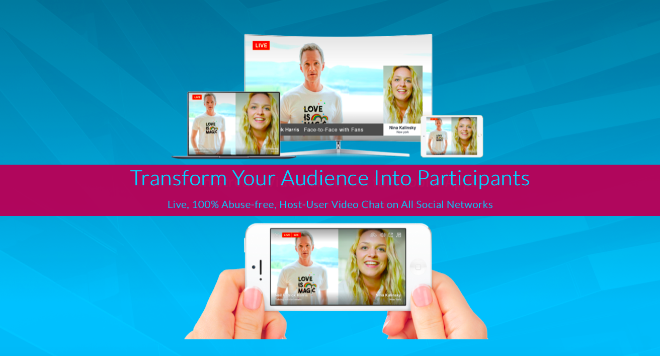
After receiving feedback on various designs, I decided to go with a modern look that could be altered if needed. I knew I wanted to keep the information the same but redesign it to a more interactive, engaging site. When entering the site, you see the call-to-action: “Engage Your Audience Anywhere,” and an animated picture of a newsroom. Underneath, the subtitle extends our services to the user.
The “Get Started” button is bright and obvious so that the user can fulfill their goals of starting a stream. If they want to find out more, the arrow points down to scroll for more information. If someone has visited many times, the Livestream button is available, as well as the Services/Contact Me.

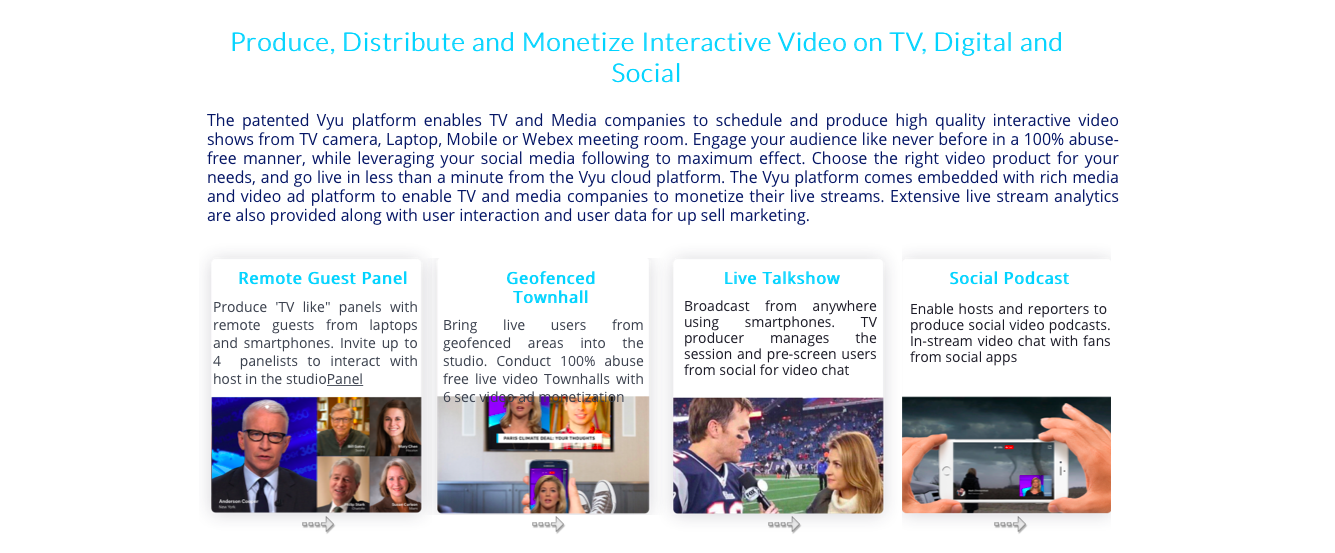
Scrolling down, one will find a description of the services/technology that Vyulabs offers. Providing
a good foundation of the company and its services will make the customers trust that we are open and
intelligent.
By adding a picture of an Instagram page in a city, I wanted to convey to the user that Vyulabs can be used anywhere on the go.

The tough part came when I attempted to convert a detailed graph into a simpler How-To list. I had to
understand the platform myself, so once I did, I stripped the tutorial into four steps.
Condensing it into four steps (Sign Up, Post, Invite, Keep Streaming) will provide them a sense of comfort and knowledge in who we are. Additionally, I included a hyperlink to the tutorial if they wanted to look further. *In the future, I think we can add a page to the graph explaining it in more detail. For the homepage, it is best to not overwhelm anyone.

At the end of the homepage, I added a moving image (this is a screenshot) and added a personality question to it. This was a choice I made that could help engage the user with the site instead of a page with information on it. The Start Here button will take the user to a page that will explain the concept in more depth. I thought it would be simpler to include the basic information on the first page as the user’s primary goal is to find a streaming service that will make their lives easier. As the user interacts more with the website and its own pages inside it, they will find more information regarding the customer “roles.”
Conclusion
This project refined my UX skills and understanding of storytelling in one page. Having a clear idea of how the website interacts with the customer is essential in visual/interactive design for organizations. This project was great practice in understanding the effect of each component’s functionality.
Meeting the clients’ needs was important and the main force of this project. Working with the site builder, I had limited options for how I can convey this company’s message.